

Summary
Project type: End-to end mobile app
Industry: Finance
Team: Independent Independent project with feedback from mentor and peers
Tools: Figma, Google Forms/Sheets, Optimal Sort, Photoshop
Background
As the older population grows, many individuals aged 60+ increasingly rely on digital services but face challenges like limited digital literacy and visual impairments. Current banking apps often overlook their needs, making navigation and security difficult. Developing user-friendly, accessible banking apps for older adults can significantly boost their financial independence and confidence.
Problem
Older adults often struggle with existing banking apps due to small text, complex navigation, and lack of support, leading to frustration and errors. This project aims to develop a banking app designed specifically for older users, prioritizing simplicity, clarity, and accessibility. Features like large text, voice commands, straightforward navigation, and dedicated customer support will empower older adults to manage their finances effectively and securely, enhancing their overall digital banking experience.
Solution
Older adults often struggle with current banking apps. Prospera is an accessibility-approved solution designed for them, featuring adjustable text size, voice commands, simple navigation, and dedicated support. Prospera empowers older adults to manage their finances securely and effectively.
Don't feel like scrolling?
RESEARCH
Methods: Competitive Analysis, User Interviews
Research Goal: The goal of this research is to evaluate the effectiveness of the newly implemented live animal viewer feature on Petco's website in enhancing user experience, facilitating informed adoption and purchasing decisions for small animals and birds, and promoting responsible pet ownership. This research aims to understand user satisfaction, identify any usability issues, and measure the impact of the feature on customer engagement and adoption rates.
Research Objective:
HMW design a banking app that simplifies complex financial transactions for the user, making it easier for him to manage his charitable donations securely?
-
HMW integrate features into the banking app that help the user plan for his move to an old-age home, ensuring his financial management is seamless and stress-free?
-
HMW create a banking app that provides intuitive tools for long-term financial planning and wealth transfer, making it easier for the user to manage her savings and pass her wealth to her children?
-
HMW design a secure and user-friendly interface that caters to the user’s need for detailed financial management without overwhelming her with unnecessary complexity?
Competitive Analysis
I began by downloading and meticulously scrutinizing prevalent products currently available to address this pertinent challenge. Engaging in a thorough assessment, I carefully examined their various features and functionalities while considering feedback from end-users. This involved exploring user reviews, usability reports, and conducting hands-on testing to understand the user experience better.
By analyzing these products in-depth, I identified their inherent strengths and weaknesses. This comprehensive analysis provided valuable insights into what works well and what areas need improvement. It also helped pinpoint potential opportunities for market expansion and enhancement. Understanding these aspects allowed me to identify gaps in the market and areas where new features or improved functionalities could be introduced to better meet user needs and preferences.
Ultimately, this detailed process laid the groundwork for developing a more effective and user-friendly solution, ensuring that the final product would address the existing shortcomings and provide a superior experience for users.


Key Takeaways:
1. Mint
-
Strengths:
-
User-Friendly Interface: Simple and intuitive, making it accessible for beginners.
-
Comprehensive Financial Overview: Aggregates accounts for a holistic financial view.
-
Budgeting Tools: Helps users track and manage their budget effectively.
-
Expense Tracking: Automatically categorizes expenses for better financial insights.
-
Security: Utilizes multi-factor authentication and encryption for data protection.
-
-
Weaknesses:
-
Data Synchronization Issues: Occasional delays or errors in syncing data.
-
Limited Customization: Automatic categorization can sometimes be inaccurate.
-
Ad-Supported Model: Ads can detract from the user experience.
-
Privacy Concerns: Concerns about the privacy and security of sensitive financial data.
-
Customer Support: Reports of slow or unresponsive support.
-
2. Acorns
-
Strengths:
-
Automated Investing: Rounds up purchases to invest spare change.
-
Low Initial Investment: Users can start investing with minimal amounts.
-
Diverse Portfolio Options: Offers diversified portfolios tailored to different risk levels.
-
Educational Resources: Provides educational content to help users learn about investing.
-
Retirement Accounts: Offers Acorns Later for retirement savings.
-
-
Weaknesses:
-
Fees on Small Accounts: Monthly fees can be relatively high for small account balances.
-
Limited Customization: Users have limited ability to customize their investment portfolios.
-
No Direct Stock Purchases: Users cannot invest in individual stocks.
-
Customer Support: Some reports of slow response times and limited support.
-
Limited Investment Choices: Focuses primarily on ETFs and does not offer more diverse investment options.
-
3. Be My Eyes
-
Strengths:
-
Accessibility and Inclusivity: Provides real-time assistance to blind and low-vision individuals.
-
Community Engagement: Utilizes a vast network of volunteers for support.
-
Versatility of Assistance: Helps with a wide range of tasks through live video calls.
-
Corporate Partnerships: Collaborates with companies to provide specialized assistance.
-
Global Reach: Available in multiple languages and regions.
-
-
Weaknesses:
-
Reliance on Volunteer Availability: Timeliness and quality of assistance can vary.
-
Privacy Concerns: Users must share visual information through live video.
-
Internet Dependency: Requires a stable internet connection.
-
Awareness and Adoption: Despite its benefits, there may be a lack of awareness among potential users.
-
Overall Insights
-
Mint excels in providing a comprehensive financial overview and user-friendly budgeting tools but faces challenges with data synchronization, customization, and customer support.
-
Acorns stands out with its automated investing and educational resources but has limitations in customization, fees for small accounts, and investment choices.
-
Be My Eyes is highly inclusive and versatile in assisting visually impaired users but relies heavily on volunteer availability and stable internet connections, with some privacy concerns.
These insights highlight the strengths and weaknesses of each product, providing a clear direction for improvements and potential market opportunities.
In-Person Interviews
Using a structured script of prepared questions, I conducted one-on-one interviews with five potential users. Each interview was recorded and transcribed into a Word document for future reference. This process allowed me to gather key insights and identify recurring themes among the participants.
During the interviews, I maintained an open and unbiased approach in my responses. Participants were selected based on the age obviously, the participants were all 60+ and had to use the smartphone.
Total Participants: 6
Ages: 60+
Learnings:
From the in-person interviews, it became evident that regular banking apps are not sufficiently tailored to the needs of the older generation. Participants highlighted significant challenges, including complex navigation, small text sizes, and a lack of user-friendly features, which collectively hinder their ability to manage finances efficiently and securely.

Affinity Mapping Findings
-
Simplified Interface: Prioritize a simplified, intuitive interface with larger text options.
-
Robust Security: Implement robust security measures and ensure transparency about these features.
-
Easy Support Access: Make customer support easily accessible within the app.
-
Personalization: Offer customizable options to tailor the user experience.
-
Timely Notifications: Provide timely and clear notifications through preferred channels.
Link for Affinity Mapping
Personas
From the themes that emerged, I then formed three personas to represent potential users for this product.
-
User Personas Identification: Utilize interviews and affinity mapping techniques to discern various user personas. Analyze behavioral patterns, preferences, and requirements of users efficiently.
-
User Personas Creation: Craft detailed user personas based on identified patterns. Each persona represents a distinct user type, highlighting their characteristic traits and behaviors.
-
User Understanding: Acquire in-depth insights into user demographics through persona analysis. This facilitates a comprehensive comprehension of diverse user profiles within the healthcare app domain.
-
Personalized Design and Development: Implement user personas as a foundation for designing and developing the app. This approach ensures the app's alignment with specific user needs and preferences.
-
Targeted Product Enhancement: Concentrate on user personas to enhance the app's functionality for its intended users. By catering to these personas, the app becomes more adept at addressing various healthcare requirements effectively.
Link for Personas


HMW design a banking app for the older users that makes their financial errands safe and simple with smooth user experience while accommodating their accessibility issues.
Project Goals
Subsequently, to facilitate well-informed decision-making regarding the app's design, it was paramount for me to meticulously reexamine and reinforce the project's objectives based on my comprehensive research findings. Defining and aligning these project goals is crucial, as it ensures that every design decision is purposeful and directed towards meeting the specific needs of the target users. By doing so, we can create a cohesive and user-centric app that effectively addresses user pain points and enhances the overall user experience.

Features Roadmap
With our product goals clearly defined, it was time to embark on the meticulous process of developing a distinguished array of features. This involved carefully prioritizing each feature, a task undertaken with strategic foresight. Each priority was determined based on its critical importance in aligning with our overarching business objectives and meeting the needs of our esteemed user base.
Below are the essential features that our app must have:

DESIGN AND PROTOTYPE
User Flow and Task Flow
I mapped out the key flows for the site to visualize how users would navigate through the design. This process helped me identify previously overlooked complexities.
I recommend clicking the image to visit the link to view the detailed flowchart, as it is too intricate to include in the case study.
Scenario 1 : Samuel has to check his account balance on his app but he has Presbyopia which causes him weak vision therefore needing bigger text font in the smartphone which helps him to read, so he needs to make a payment to his son and check his bank balance after the transaction.
Flow 1: New Users create a new account


Flow 2: Existing users make a fund transfer or a transaction


Sitemap
sitemaps play a crucial role in structuring and organizing content, providing a clear visual representation of the site’s hierarchy and navigation flow. They help designers plan the user journey by outlining how users will access and interact with different sections of the website. Additionally, sitemaps facilitate communication and collaboration among team members, ensuring a shared understanding of the site’s structure and user experience goals.

Research
1. Ensuring Mobile Accessibility: We need to understand how to create mobile apps that are accessible and inclusive to all users. By learning what challenges people with disabilities experience when interacting with interfaces, designers can develop best practices and achieve their accessibility goals. Generally, we may split the majority of impairments into 4 categories:
-
Visual impairments: Visually impaired individuals have difficulty interpreting interface elements. Mild forms of visual impairment can include things like the need for reading glasses to see up close. More severe forms include things like total blindness. Color blind people may not be able to clearly discern certain colors, so you shouldn’t rely on color alone to indicate errors or active states.
-
Auditory impairments: Auditory impairments are characterized by a partial or complete loss of hearing ability. Older people may have mild age-induced hearing problems, while some people may experience total hearing loss or deafness. When interacting with interfaces, users may struggle to listen to audio or video content. Adding transcripts and captions can be a solution.
-
Mobility impairments: Mobility impairments affect gross motor skills (like walking) or fine motor movement. Users experience difficulties manipulating objects by hand and may need special equipment or alternative methods to access the content. A temporary mobile impairment like a broken arm impacts users' abilities to type on a mobile keyboard or perform other tasks with their phone. A permanent mobile impairment like paralysis after trauma requires users to use assisting devices to access mobile devices.
-
Neurological and cognitive impairments: Neurological and cognitive impairments may be inherited or caused by brain or nerve injuries, infections, lifestyle, or environmental health problems. Epilepsy, learning disabilities, neuromuscular disorders, autism, ADD, brain tumors, cerebral palsy, etc., can affect one’s ability to learn, remember, or concentrate. They can also interfere with vision, hearing, and movement abilities. For example, employing large blocks of small text without enough spacing or using a typeface with low legibility can affect users with dyslexia as well as visually-impaired people.
2. Importance of WCAG standards:
WCAG standards regulate accessibility for web pages and web applications. But what about mobile? Mobile devices are so different from desktop/laptop systems that they definitely require a unique approach to meeting accessibility regulations. In reality, the gap between them isn't that large. For example, many desktop/laptop devices have a touchscreen, while many mobile devices can be operated with an external keyboard and mouse.
Furthermore, most UI components and design patterns are used in both desktop/laptop and mobile systems. That's why you can and should rely on WCAG 2.1 recommendations to maintain accessibility on both web and non-web interfaces.
WCAG's recommendations may appear too overwhelming at first. However, WCAG's 4 principles can help designers keep things a bit more systemized.
-
Perceivable: Users should be able to access and process your content properly. Ideally, your system should address various disabilities and work with different types of assistive technology devices.
-
Operable: "Operable" means people should be able to access key features and functions through more than one method. For example, you should provide enough touch target sizes for interactive elements, consider alternative input entries, and ensure users have other ways to access features that are generally approached through gestures.
-
Understandable: Users must be able to not just access but also understand the content. Clear labels, concise sentences, and adequate instructions help clarify to users what they should do to complete a task.
-
Robust: Systems should support various operating systems, browsers, and assistive technologies that their target audience may use. Following development standards and conventions ensures your code is supported across platforms without obstacles.
3. Design for varying screen sizes: Smaller screen size is one of the main challenges of mobile design. One of the first decisions you should make is to decide on the design approach — responsive or adaptive. Or you may want to go with a native app. Regardless of the design approach, you'll need to optimize information for a mobile viewport and declutter the interface to maintain scannability and clarity.
What other practices can help designers maintain accessibility even on a small screen?
-
Information hierarchy: If you have an existing website or a desktop application, you cannot simply cut off half of the content to optimize it for a mobile app. Instead, you need to tailor content to mobile usage scenarios. Include fewer content modules and fewer images and prioritize things, placing the most popular features on top where users see them first.
-
Use mobile UI components with caution: At first sight, using tabs, modals, cards, dropdowns, accordions, and other similar elements can seem to be a great help as they reveal additional content on request and take up less space. However, they may be challenging for users with impairments. To enhance accessibility, enlarge the font size and provide a large enough touch target zone to minimize the needs of users with low vision to zoom in on content.
-
Avoid placing elements in a row: Elements placed in a row are harder to scan. You also don't have as much horizontal space on a mobile device. Place form fields or selection controls (like checkboxes and radio buttons) below each other.
4. Color contrast for accessibility: Color is a powerful tool for delivering information and impacting users' emotions. Designers rely on color to inform users about errors, indicate active and disabled states, show interactivity, group related objects, or make an element stand out.
That's why it is so crucial to maintain a sufficient color contrast ratio. It's especially relevant for mobile devices that people often use outside under extreme sunlight where they may not be able to see interface elements well.
WCAG’s standards require a color contrast ratio of at least 4.5:1 for normal-sized text (smaller than 24px or 18.5px if bold) and at least 3:1 for larger text (larger than 24px or 18.5px if bold).


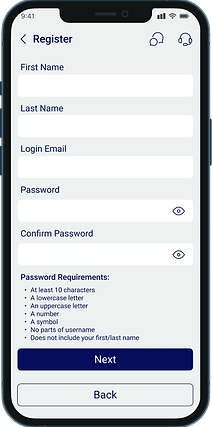
Low-Fidelity Wireframes
With the key flows meticulously mapped out, I conducted an extensive evaluation of various organizational apps to analyze diverse design patterns for inspiration. Using these insights, I began creating low-fidelity wireframes on Figma. Through numerous iterations of pivotal screens, I was able to articulate and materialize all my conceptual ideas. These low-fidelity wireframes were invaluable in refining the design, allowing for quick adjustments and feedback before developing the final, high-fidelity wireframes.
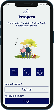
Home Screen with fingerprint login with an option for passcode login
My initial design: Home Screen with fingerprint login with an option for passcode login
The first screen after login which will comprise of all the vital functions one need to make in transactions


Account Details Page with the transaction history

Branding
To capture the essence of my vision for the app as an organic, healing space with a strong sense of community, I began by creating a detailed moodboard. This moodboard featured natural color palettes, soft textures, and imagery that evokes tranquility and connection. The branding elements were carefully selected to reflect this vision, using earthy tones, gentle typography, and harmonious visuals to create an inviting and soothing user experience. The goal was to design an app that feels like a sanctuary, fostering a sense of belonging and support among users. Every aspect of the branding was designed to resonate with the values of mindfulness, wellness, and community, ensuring that users feel both comforted and connected when using the app.


UI Kit
After finalizing the high-fidelity wireframes, I developed a comprehensive UI kit that prioritizes accessibility and inclusivity to ensure a seamless and equitable user experience. This UI kit includes pre-designed elements such as buttons, icons, typography, and color palettes, all crafted with accessibility standards in mind.
Each element is designed to meet WCAG (Web Content Accessibility Guidelines) standards, ensuring features like sufficient color contrast, readable font sizes, and touch-friendly components for users with varying abilities. The kit serves as a foundation for creating a consistent and user-friendly interface, enabling clear navigation and interaction for all users, including those with visual, motor, or cognitive impairments.
By incorporating accessibility-focused design principles, the UI kit streamlines the design-to-development handoff while ensuring that all components promote usability for everyone. This approach not only maintains design coherence across the app but also supports the creation of features and updates that are inclusive, equitable, and future-proof.


High-Fidelity Wireframes
With a focus on accessibility and ease of use, I meticulously crafted the high-fidelity wireframes for Prospera, ensuring they adhered to the visual style and design principles of clarity and inclusivity. Each iteration of key screens was carefully refined, balancing functionality with aesthetics. I saved multiple iterations of the wireframes to document the progression and maintain a record for future enhancements.
Incorporating feedback from usability experts and potential users, I fine-tuned the designs to address pain points and enhance overall usability. Once the wireframes reached a polished state, I advanced to prototype development, preparing the design for comprehensive usability testing to validate its effectiveness and alignment with user needs.


TESTING & ITERATION
Usability Testing
Using the Figma prototype, I conducted in-depth usability testing on two key site functions to evaluate user interactions, uncover potential pain points, and refine the design iteratively for optimal usability and an exceptional user experience.
The testing process involved recruiting a diverse group of participants representing the target audience. Each user was tasked with completing essential site functions, allowing me to observe their interactions closely and note any challenges or inefficiencies they encountered.
After the testing sessions, I collected and analyzed both qualitative and quantitative data, including user feedback, task completion rates, and time on task. This analysis highlighted common pain points and areas for improvement. Leveraging these insights, I made iterative updates to the prototype, progressively enhancing its functionality and usability.
This thorough approach not only validated design decisions but also ensured the final product delivers a seamless, intuitive, and user-friendly experience tailored to the needs of its audience.

FINAL DESIGN
Final High-Fidelity Wireframes
After conducting peer reviews and usability tests of my UI, I implemented significant enhancements to improve the app's accessibility and inclusivity. The usability tests provided critical insights into how users interact with the app, highlighting areas where improvements were needed to cater to a diverse range of users, including those with disabilities. By analyzing these results, I refined key elements such as color contrasts, text sizes, and navigation to create a more intuitive and user-friendly experience.
The usability tests also emphasized the importance of robust accessibility features. In response, I upgraded voice assistance and integrated other tools to address user needs more effectively. These changes were thoroughly tested with real users, ensuring that the app is practical, efficient, and accessible for all.
By combining peer reviews with usability test findings, I followed an iterative process of feedback, refinement, and validation. The final designs are not only visually appealing but also highly functional and ready to support a wide range of users in the next development phase.


Future Iterations & Retrospective
Future Iterations
Future iterations of the app can focus on several key enhancements to create a more engaging and inclusive user experience:
-
Personalization through AI-Driven Recommendations:
-
Introduce tailored content and activity suggestions based on individual user preferences.
-
Utilize machine learning to adapt recommendations as users interact with the app.
-
-
Enhanced Community Features:
-
Expand forums, group activities, and peer support networks to foster a stronger sense of connection and belonging.
-
Enable users to participate in community-driven events and discussions.
-
-
Advanced Accessibility Options:
-
Integrate customizable interfaces for diverse user needs.
-
Enhance voice assistance and other assistive technologies for better inclusivity.
-
-
Continuous Improvement through Feedback:
-
Regularly collect and analyze user feedback to identify pain points and improvement opportunities.
-
Monitor usage data to refine features and ensure the app evolves with user expectations.
-
By focusing on these areas, the app can provide a more personalized, connected, and accessible experience for its users while staying relevant to their changing needs.
Retrospective
Reflecting on the process of designing this app has been an enriching journey of creativity, learning, and growth. With a clear goal of crafting an intuitive, user-friendly experience, the process required a deep understanding of user needs, meticulous planning, and continuous refinement.
-
Establishing a Foundation:
Started with comprehensive research and mapping out user flows to align with the app’s goals.
Analyzed design patterns from successful apps in similar domains for inspiration and functionality.
Created low-fidelity wireframes to ideate quickly and test fundamental concepts.
-
Focusing on Detail and Usability:
Transitioned to high-fidelity wireframes, concentrating on visual appeal and seamless usability.
Incorporated iterative feedback loops and usability testing to refine the designs further.
-
Consistency through Design Systems:
Developed a comprehensive UI kit to maintain consistency and streamline development.
Created mood boards and branding elements to capture the app’s ethos and communicate its identity effectively.
-
Enhancing Inclusivity:
Incorporated peer reviews and accessibility enhancements to make the app inclusive and welcoming to all users.
Focused on visual contrasts, adaptive layouts, and assistive features to ensure a wider reach.
Key Takeaways:
This process reinforced the value of a user-centered approach, emphasizing the importance of listening to feedback and adapting designs iteratively.
Collaboration, detailed planning, and creative exploration were pivotal in transforming ideas into a cohesive, functional product.
Ultimately, this project was a transformative experience, deepening my expertise in crafting meaningful digital solutions while staying grounded in user needs and values.